Tom Weld talks about the processes – both physical and mental – used when creating the ‘maps’ that will shown upstairs at the Blue House Gallery from 12 – 24 May 2017.
A lot of the ideas for my ‘maps’ have related to borders, walls, fences for several years. Now, there seems to be a renewed vogue for building a wall round your perceived ‘problem’, even if it results in walling yourself in (the 4 metre high walls round the ‘secure’ ‘communities’ in London and many cities for example).
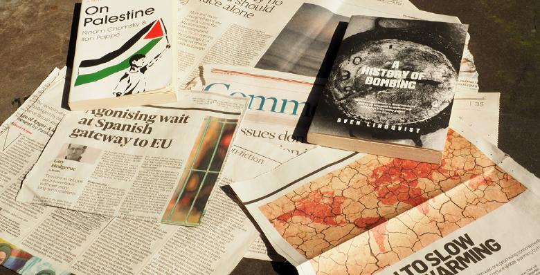
So I collect avidly books (On Palestine by Noam Chomsky and Ilan Pappe) and cuttings, articles and maps, watching the ongoing chaos in many countries still being caused by colonial map-making, the antics of Trump v. Latin America, etc.
© BLUE HOUSE GALLERY, MAIN STREET, SCHULL, COUNTY CORK, IRELAND
All images are copyright of the Artists and are not to be reproduced without express permission
website realisation john@bigboydesign.co.uk © 2015
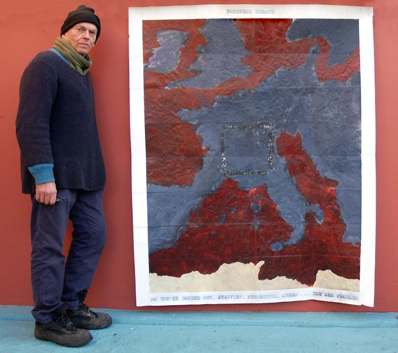
I like to give the ‘maps’ features of real maps, like borders(!) and folding, so the first step is to choose a size. Only recently I have started making larger ‘maps’, roughly 6 by 4 feet, and avoiding using masking tape for the borders by folding the margins under. Then they are usually primed with white oil-based primer.
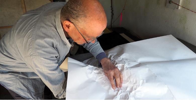
Now the hard work (for arthritic, fairly old hands), crumpling the paper, a process I stumbled on some years ago for producing the look of landforms seen from above, like in satellite photographs from ‘space’. By this stage I have a place in mind, a kind of terrain, and a subject matter, and these inform the type of crumple.
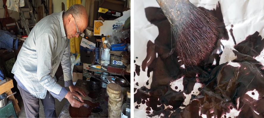
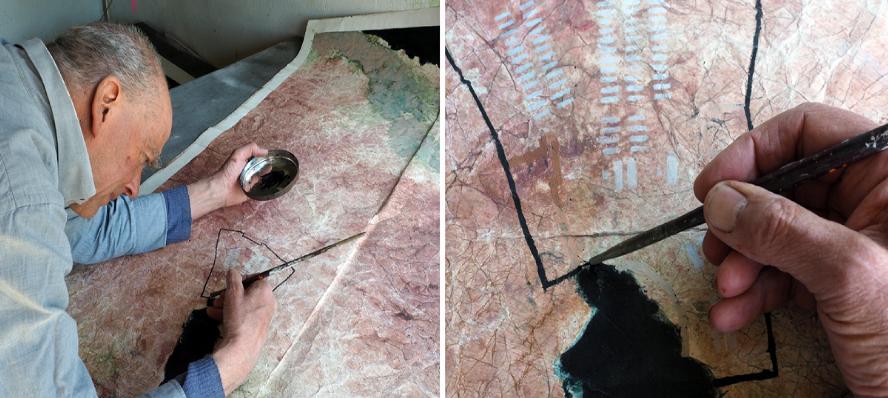
When liquid paint or printing ink is brushed or poured onto this surface, it drains off the ridges and collects in the hollows. Rubbing brush, rag, charcoal, or pastel across the surface results in colour sticking mainly to the ridges. This is the best bit, where whatever the final ‘message’ of the ‘map’, I am working entirely with colour and composition.
Similarly, when adding any map-like markings, like dotted lines or cross-hatched areas, I choose the colour and the position to maximize the visual impact of the painting.
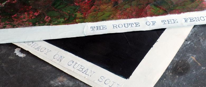
Ever since I started ‘map-making’, the titles have been an intrinsic part of the piece, and I made them using an old typewriter with a worn out tape which I’d have to bang down at least three times. (This was a not very subtle pointer to a world post-breakdown, post computer, maybe post electricity etc). I still use the typewriter, but now scan the typed words, blow them up to the right size in Photoshop, then use iron-on transparency film to stick them to the paper.
I like the ‘maps’ to attract attention because they have an interesting, maybe beautiful surface, only then for the viewer to read the words and sometimes at least get a shock on realizing what the painting is about. The words are crucial, and require a lot of thought. The ‘maps’ juxtapose the beauty of the Earth – when seen from far enough away – with the reality of what is happening now, or in the past, or in the future.
